.ghl-submit-btn, .ghl-footer-next, and .ghl-footer-back inside .ghl-footer-preview. Paste only the rules you need, save, publish, and test the live survey on desktop and mobile. If the survey is embedded, put the CSS inside the survey—not in the surrounding funnel or WordPress page—because the iframe isolates its internal buttons.
Before writing code: HighLevel’s current button panel can already set themes, solid or gradient backgrounds, typography, width, padding, borders, corner radius, and shadows. Use those controls for normal styling. Add CSS when you need a precise hover effect, different treatment for Back and Next, an animated state, or a rule the visual panel does not expose.
Start with the right survey CSS workflow
Button styling problems usually come from one of three causes: the code was added at the wrong level, the selector does not match the current survey markup, or a builder rule has greater priority. A repeatable workflow prevents all three.
- Duplicate the survey. Keep a working copy before changing production CSS.
- Set the basics visually. Choose the button theme, dimensions, typography, and mobile layout in the builder.
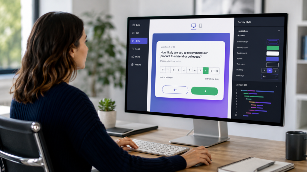
- Open Custom CSS. In the survey builder, select Styles, expand Advanced, and find Custom CSS.
- Add one recipe. Do not paste five competing button systems at once.
- Save and publish. A builder preview can differ from the published or embedded experience.
- Test every state. Check Back, Next, Submit, hover, keyboard focus, disabled behavior, and mobile width.
The earlier guide on how to set up phone and email rebilling in GoHighLevel deals with agency-level service configuration. Survey CSS is location content and should be changed inside the specific survey asset. That separation matters when agencies manage many client sub-accounts: document which location and survey received each code block.
The three survey-button selectors to know
| Selector | Usually targets | Best use |
|---|---|---|
.ghl-footer-preview .ghl-footer-next |
Next button | Primary forward action |
.ghl-footer-preview .ghl-footer-back |
Previous or Back button | Secondary, lower-emphasis action |
.ghl-footer-preview .ghl-submit-btn |
Final Submit button | Completion CTA |
HighLevel documents these classes for current surveys, but hosted software can change its markup. If a selector stops working, preview the published survey, right-click the button, choose Inspect, and confirm the class. Avoid targeting a long chain of generated wrappers or an unpredictable element ID when a stable class is available.
Recipe 1: clean branded buttons
This is the safest starting point. It creates consistent sizing, readable contrast, rounded corners, and a modest hover effect for all three navigation actions.
.ghl-footer-preview .ghl-footer-next,
.ghl-footer-preview .ghl-footer-back,
.ghl-footer-preview .ghl-submit-btn {
  min-height: 48px;
  padding: 12px 24px !important;
  border: 2px solid #2563eb !important;
  border-radius: 8px !important;
  background: #2563eb !important;
  color: #ffffff !important;
  font-size: 16px !important;
  font-weight: 700 !important;
  line-height: 1.25;
  cursor: pointer;
  transition: background-color .2s ease,
              border-color .2s ease,
              transform .2s ease;
}

.ghl-footer-preview .ghl-footer-next:hover,
.ghl-footer-preview .ghl-footer-back:hover,
.ghl-footer-preview .ghl-submit-btn:hover {
  background: #1d4ed8 !important;
  border-color: #1d4ed8 !important;
  transform: translateY(-1px);
}
Replace both blue hex values with approved brand colors. Keep the text contrast strong and retain a minimum button height near 44–48 pixels so the controls remain comfortable to tap.
Recipe 2: make Back secondary and Next primary
Previous and Next should not always compete visually. This pattern gives the forward action a solid treatment and turns Back into a quieter outline button.
.ghl-footer-preview .ghl-footer-next,
.ghl-footer-preview .ghl-submit-btn {
  background: #7c3aed !important;
  border: 2px solid #7c3aed !important;
  color: #ffffff !important;
  border-radius: 999px !important;
  padding: 13px 28px !important;
  font-weight: 700 !important;
}

.ghl-footer-preview .ghl-footer-back {
  background: transparent !important;
  border: 2px solid #7c3aed !important;
  color: #6d28d9 !important;
  border-radius: 999px !important;
  padding: 13px 28px !important;
  font-weight: 700 !important;
}

.ghl-footer-preview .ghl-footer-back:hover {
  background: #f5f3ff !important;
}
Do not reduce Back to a tiny text link if respondents may need to correct an answer. Visual hierarchy should clarify the preferred direction without hiding navigation.
Recipe 3: accessible keyboard focus
Hover styling helps mouse users, but it does nothing for someone navigating by keyboard. Add a visible :focus-visible ring that does not rely on color alone.
.ghl-footer-preview .ghl-footer-next:focus-visible,
.ghl-footer-preview .ghl-footer-back:focus-visible,
.ghl-footer-preview .ghl-submit-btn:focus-visible {
  outline: 3px solid #f59e0b !important;
  outline-offset: 3px;
  box-shadow: 0 0 0 5px rgba(245, 158, 11, .25);
}
Never remove the outline unless you replace it with an equally obvious focus indicator. Test by pressing Tab through the live survey without using a mouse.
Recipe 4: modern gradient without sacrificing clarity
HighLevel now supports gradients directly in the button panel, so use the native setting when a simple gradient is all you need. The CSS version is useful when you also want a controlled hover shift and shadow.
.ghl-footer-preview .ghl-footer-next,
.ghl-footer-preview .ghl-submit-btn {
  background: linear-gradient(135deg, #2563eb, #7c3aed) !important;
  border: 0 !important;
  color: #ffffff !important;
  border-radius: 10px !important;
  padding: 14px 26px !important;
  box-shadow: 0 8px 18px rgba(37, 99, 235, .24);
  transition: transform .2s ease, box-shadow .2s ease;
}

.ghl-footer-preview .ghl-footer-next:hover,
.ghl-footer-preview .ghl-submit-btn:hover {
  transform: translateY(-2px);
  box-shadow: 0 11px 23px rgba(37, 99, 235, .32);
}
A gradient should still provide enough contrast behind the label at every color stop. Preview it on more than one screen; bright displays can disguise weak contrast.
Recipe 5: full-width mobile survey buttons
Use a media query when compact side-by-side controls feel cramped on phones. This rule stacks the buttons and makes each one a large touch target.
@media (max-width: 480px) {
  .ghl-footer-preview .ghl-footer-next,
  .ghl-footer-preview .ghl-footer-back,
  .ghl-footer-preview .ghl-submit-btn {
    display: block;
    width: 100% !important;
    min-height: 48px;
    margin: 8px 0 !important;
    padding: 13px 18px !important;
    font-size: 16px !important;
  }
}
HighLevel also provides a dedicated mobile editor, so first check whether its layout and typography controls solve the problem. Keep the media query when you need an exact breakpoint or behavior unavailable in that panel.
Recipe 6: subtle press feedback and reduced motion
A small press state makes a button feel responsive. Respect visitors who request reduced motion by disabling decorative movement for them.
.ghl-footer-preview .ghl-footer-next:active,
.ghl-footer-preview .ghl-footer-back:active,
.ghl-footer-preview .ghl-submit-btn:active {
  transform: translateY(1px) scale(.99);
}

@media (prefers-reduced-motion: reduce) {
  .ghl-footer-preview .ghl-footer-next,
  .ghl-footer-preview .ghl-footer-back,
  .ghl-footer-preview .ghl-submit-btn {
    transition: none !important;
    animation: none !important;
  }
}
Build one maintainable button system
The recipes above are a menu, not a single block to paste in full. Choose a base style, then add only the focus, mobile, and motion enhancements you need. If two recipes set the same property, the later rule may win, producing results that feel random even though the browser is following the cascade correctly.
Use native themes and button controls for ordinary appearance.
Add one narrowly scoped CSS recipe for special behavior.
Publish and test every button, state, slide, and screen size.
Save the final code, survey name, location, and test date.
Why GoHighLevel survey button CSS is not working
| Symptom | Likely cause | First fix |
|---|---|---|
| Nothing changes | CSS is on the page outside the iframe | Move the rule to the survey’s Styles → Advanced → Custom CSS area. |
| Preview changes, live survey does not | Unpublished revision or cache | Save, publish, then open the live URL in a private window. |
| Next changes but Submit does not | Submit selector omitted | Add .ghl-submit-btn to the selector group. |
| Color changes but radius does not | Higher-priority builder rule | Increase selector specificity; use !important only on the conflicting declaration. |
| Buttons overflow on mobile | Fixed width or excessive padding | Remove fixed pixels and apply the full-width mobile recipe. |
| Text becomes unreadable | Theme and CSS colors conflict | Set text and background together, then verify contrast in every state. |
| Only one survey is broken | Different theme, markup, or duplicate CSS | Compare its custom CSS and inspect the published button classes. |
Use !important carefully
HighLevel’s official examples use !important for button colors because builder styles can otherwise override custom rules. It is acceptable as a targeted override, but putting it on every declaration makes future maintenance harder. Start with a scoped selector such as .ghl-footer-preview .ghl-footer-next. Add !important only to the property that loses to the builder.
Also avoid broad rules such as button { ... }. They can unintentionally affect unrelated buttons, controls, or accessibility behavior. Scoping your selectors to the survey footer reduces collateral changes.
Pre-publish survey button checklist
- Duplicate or export a record of the original survey before editing.
- Use native styling controls for settings they already support.
- Paste CSS into the survey itself, especially when it is embedded in an iframe.
- Confirm Back, Next, and Submit selectors on the published survey.
- Check normal, hover, keyboard-focus, active, and disabled states.
- Verify readable contrast and a visible focus indicator.
- Test at narrow mobile widths and with long translated button labels.
- Complete a real test submission and confirm navigation still works.
- Record the final CSS and remove abandoned or duplicated rules.
Build surveys and follow-up automation in one platform
GoHighLevel combines survey building, contact records, conditional workflows, messaging, and funnel pages. Start with native styling, add only the CSS you need, and test the full submission path before launch.
Affiliate disclosure: If you sign up through this link, Local Resource Hub may earn a commission at no additional cost to you.
Frequently asked questions for GoHighLevel Custom CSS Codes for Survey Buttons
Where do I paste custom CSS for a GoHighLevel survey?
Open the survey builder, select Styles, expand Advanced, and paste the code into Custom CSS. Save and publish the survey after making changes.
Why can’t my funnel page CSS change an embedded survey button?
The embedded survey loads inside an iframe. CSS on the parent funnel, website, or WordPress page can style the iframe container but cannot cross that boundary to style the survey’s internal fields and buttons. Add the code inside the survey builder.
What CSS selector changes the GoHighLevel Next button?
The current documented selector is .ghl-footer-preview .ghl-footer-next. Confirm it with browser inspection if the platform markup changes or a particular survey theme behaves differently.
How do I style the Submit button separately?
Use .ghl-footer-preview .ghl-submit-btn for the final submission control. Give it a distinct style only when that difference helps users understand that they are completing the survey.
Do I need !important in GoHighLevel custom CSS?
Not always. Use a specific, scoped selector first. If an inline or builder-generated rule still wins, add !important only to the conflicting property instead of applying it everywhere.
Can I create a gradient survey button without CSS?
Yes. HighLevel’s current button styling controls include gradient backgrounds with supported gradient types, angles, colors, and stops. CSS remains useful for custom hover, focus, movement, or selector-specific behavior.
Will these codes change survey answer options?
No, the provided recipes target footer navigation and submission buttons. Answer choices use different elements. Inspect those controls and create separately scoped rules rather than broadening these selectors blindly.
Keep the CSS smaller than the problem
The best GoHighLevel survey button customization is usually a native foundation plus a short, documented CSS enhancement. Scope the selector, preserve keyboard focus, test the iframe version, and publish only after all navigation states work. When a style fails, diagnose placement, selector, cascade, and cache in that order instead of adding more overrides.
For help with other account, integration, communications, and builder issues, return to the GoHighLevel troubleshooting guide.